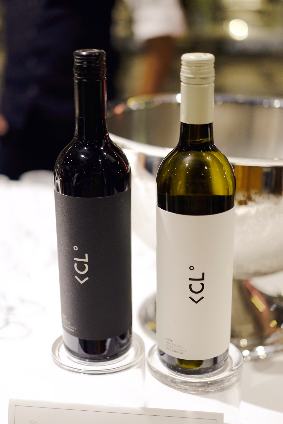
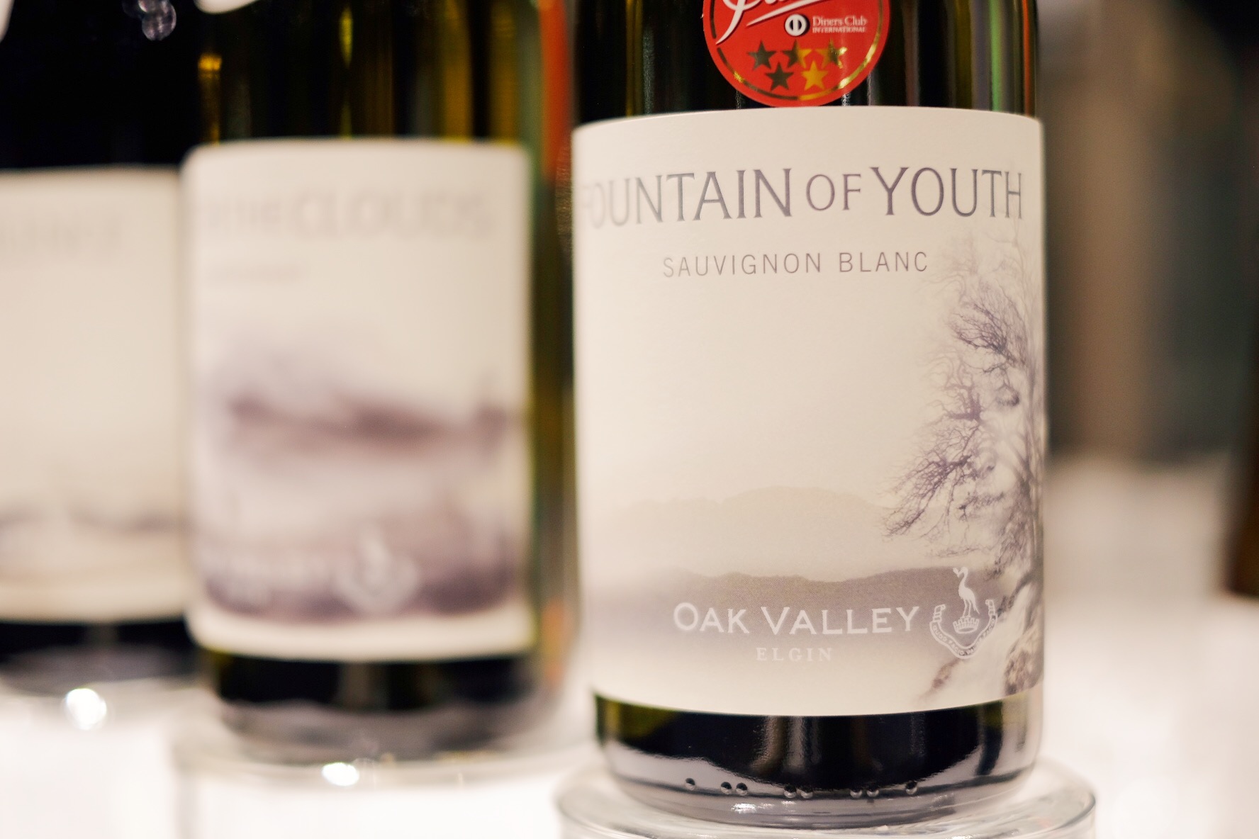
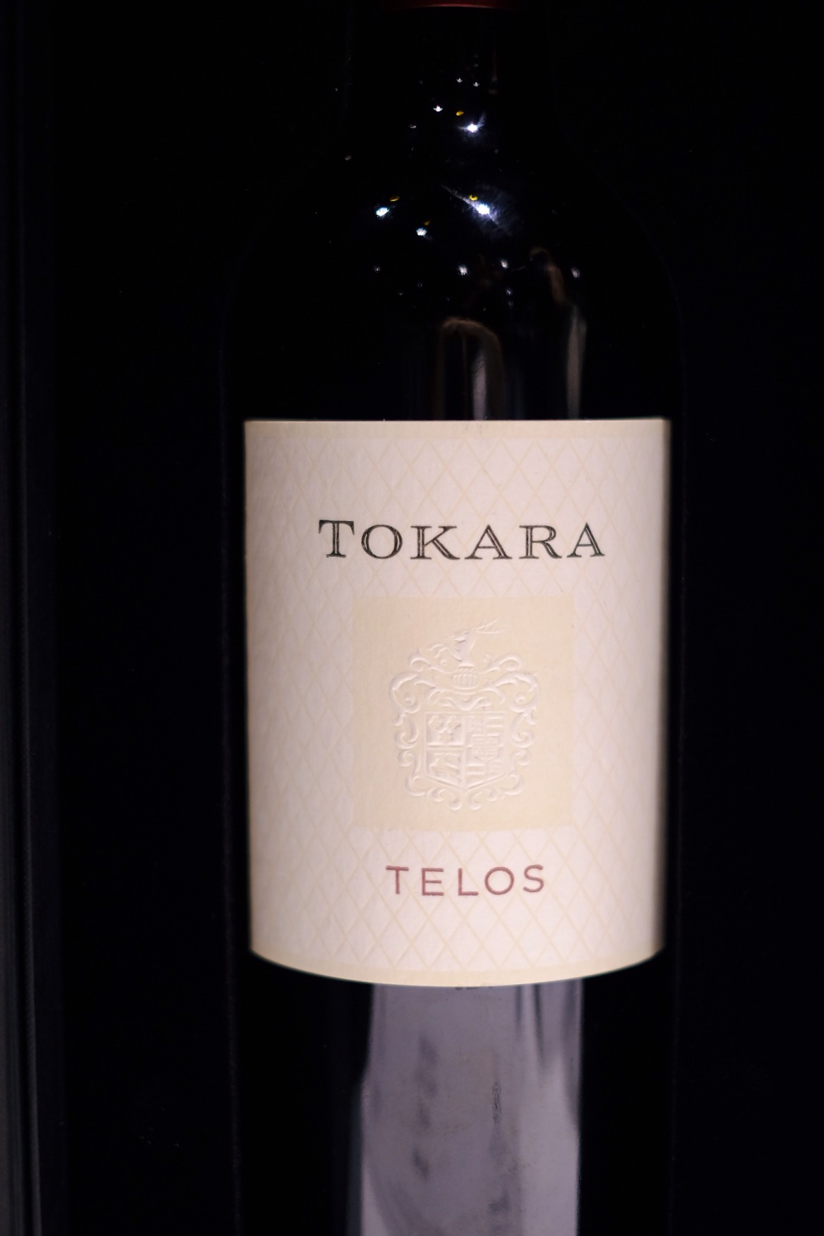
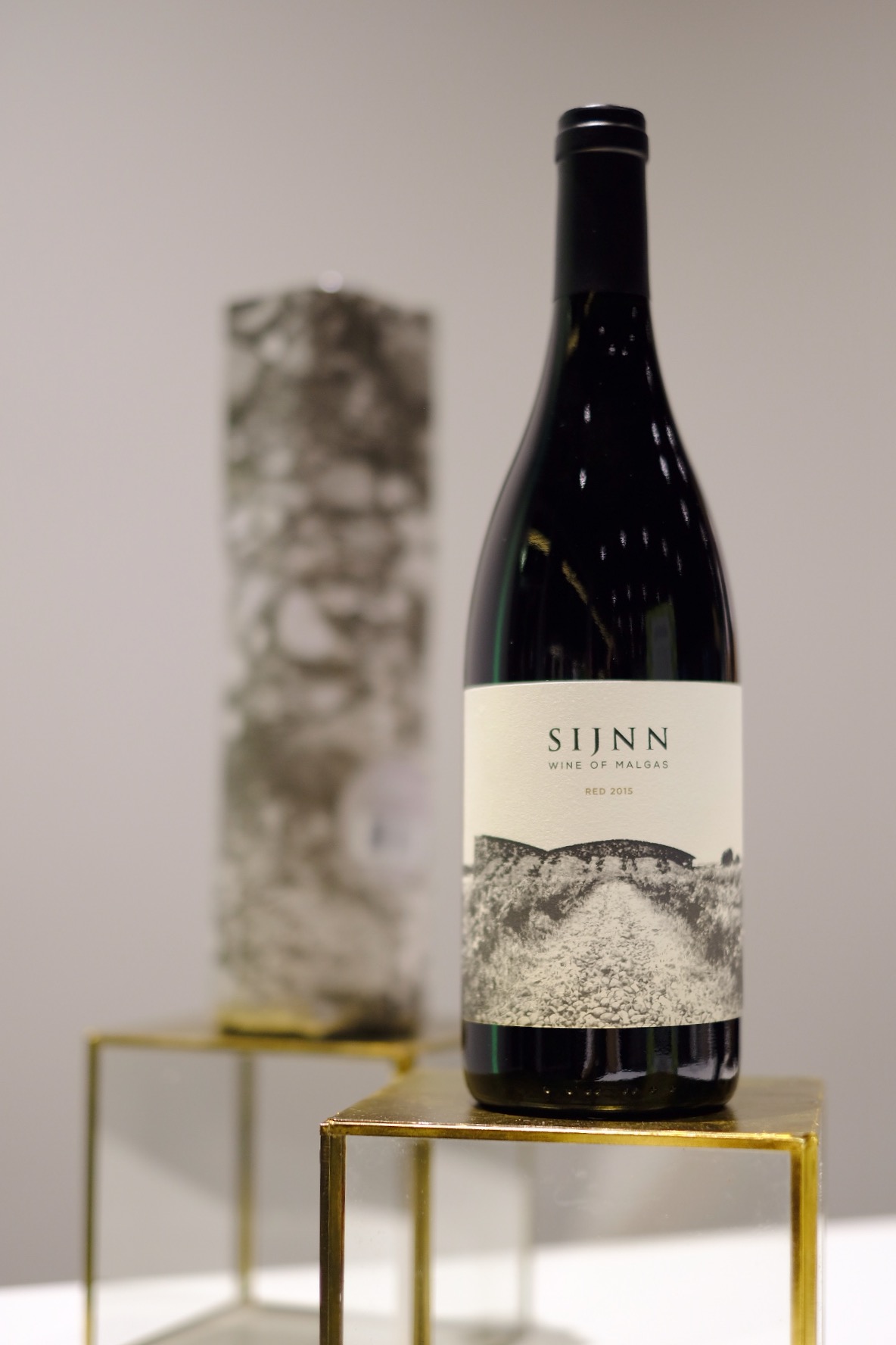
“Packaging sells the first bottle. The producer sells the second.”
International guest speaker Stefano Pistoni of UPM Raflatac, one of the world’s most forward-thinking adhesive paper manufacturers, made this pronouncement a few weeks ago to a room packed full of winemakers, wine marketers and designers, who were gathered to receive the results of Winemag’s fifth annual Wine Label Design Awards.
He was, of course, preaching to a rather tuned in choir – an audience comprised of individuals who did not need to be persuaded as to the importance of packaging. While the turnout at the newly revamped Hazendal Wine Estate was nothing to sneeze at, the group arguably represented a minority in an industry often criticized for being disproportionately obsessed with substance over form.
LUNG CAPACITY
When you think about it, the wine industry is pretty old school when it comes to packaging. Few question exactly why we haven’t mixed it up since the mid-1800s when the familiar claret bottle came into vogue (apparently the average pre-Industrial glassblower’s lung capacity equated to roughly 750ml in bottle volume – and the buck stopped there). Much like the QWERTY keyboard, the layout of which was initially optimised to avoid typewriter lever jams, we are left with the legacy of the 750ml bottle and an expansive production, distribution and consumption system surrounding it. Of course, there’s bag-in-box (which actually has little stigma in countries like Sweden), but this is not the mainstream, especially on the premium end of the spectrum. And then admittedly there’s a suite of other options from single-glass servings to rectangular PET bottles, skinny enough to slide through a letterbox slot– but these are the exception, not the rule.
All of that said, I’m not one to throw the baby out with the bathwater – consistency can be both practical and aesthetically pleasing. I, for one, get a real kick when gazing upon my wine rack of diverse, yet uniformly sized bottles. There’s also an argument that 750ml is the minimum effective size for bottle maturation, as well as encouraging the social element of wine (if at least 750ml needs to be consumed, one would do well to share it). And at the end of the day – glass just feels nice.
BAG-IN-A-BOX
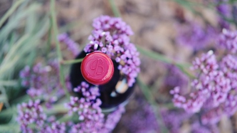
The winners of the recent Wine Label Design Awards would indicate that much of the packaging innovation happening in the South African wine industry is concentrated on labels themselves, working within the framework of the 750ml glass bottle (one exception being gold winner Ben Wren Wine Co.’s attractive bag-in-box, aimed at challenging the idea that premium wine has to always be in glass).
THE PANEL
As for the glass league, it’s not just about a pretty picture. Judged by a diverse panel (Christian Eedes, editor of Winemag.co.za; Rebecca Constable, specialist buyer for wine at Woolworths; Franck Dangereux, chef and co-owner of the Foodbarn at Noordhoek Farm Village; Sean Harrison, advisor to brand consultancy Graft; and Carla Kreuser, independent graphic designer and illustrator), the 83 entries for 2019 were judged according to originality of concept, execution, shelf appeal and effectiveness as a piece of communication.
According to WineMag’s official report, Judge Carla Kreuser felt that the quality of work continues to improve year on year, commenting that “South African wine was increasingly “coming of age” in the sense that far more entries appeared to be based on an original concept executed with confidence rather than being derivative or clichéd.”
THE VERDICT
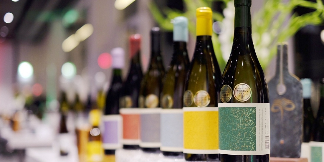
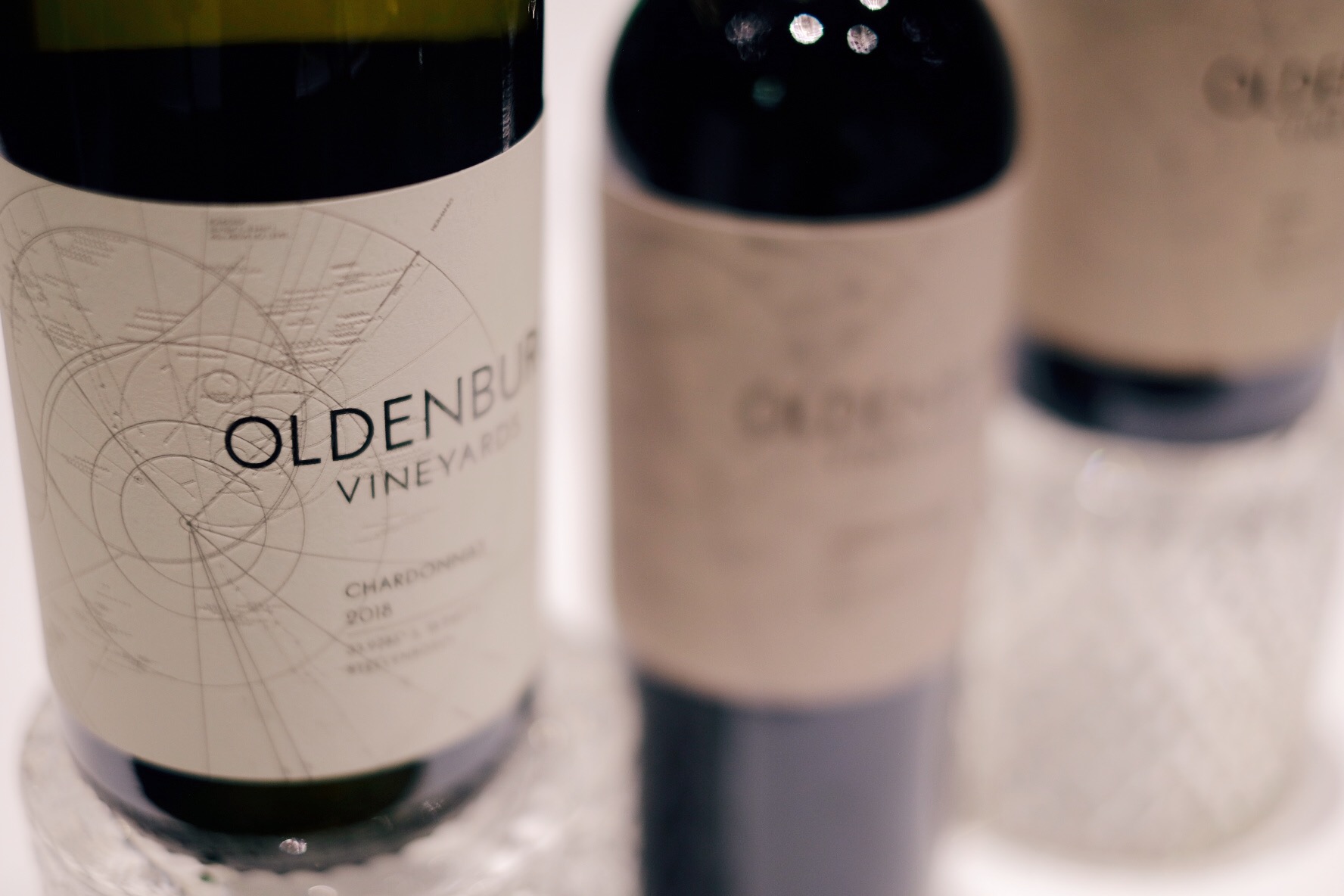
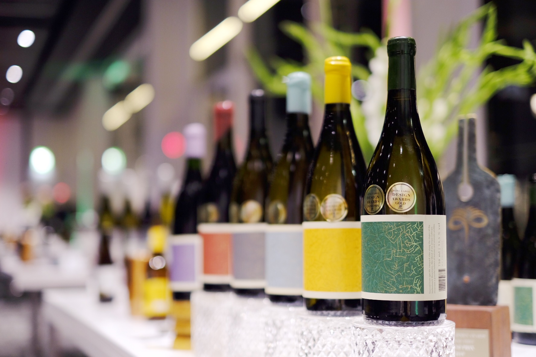
I must say I agree. Across the categories (R80 a bottle or under; over R80 a bottle; R500 a bottle and over; and labels forming a series), we saw labels that were not only funky or eye-catching, but which also communicated authentically about the wines within. This culminated in Grand Prix winner The Wine Thief’s entry – a series of wines crafted by sommelier Ewan Mackenzie in collaboration with various producers across the Western Cape. The design for each label in the series is the same, except for the colour and capsule that change according to the wine.
The label design incorporates elements from three different 1948 Ordinance Survey maps of the winelands (specifically the Slanghoek valley, Bot River and the Paardeberg), overlaid on top of each other. According to Winemag’s report, “what Mackenzie and design firm Studio Collective succeed in communicating is that he is utterly committed to terroir but in a way that is easily reproducible and hence cost-effective. The printing of the labels itself is also such as to save money while still looking premium. A final touch are the wine boxes – Mackenzie rather cheekily recycles those from other, more established producers turning them inside out and then spray-painting them with his own logo. The judges very much liked how this went towards addressing the important issue of sustainability.”
A label is, at its essence, a form of print media, and like other forms thereof, is most effective when it tells an engaging story. Moreso, how much better, when the contents confirm the beauty of the form, and the story rings true.
Words & Images: Kristen Duff
Shop Wine Label Design Awards Winners now on Port2Port
